Every identity and website here is live, linked, and doing its job right now. No mockups on angled phones, no work we can’t show you shipping. Click through to any of them, and where we wrote the brand’s rulebook, the guidelines are published too.
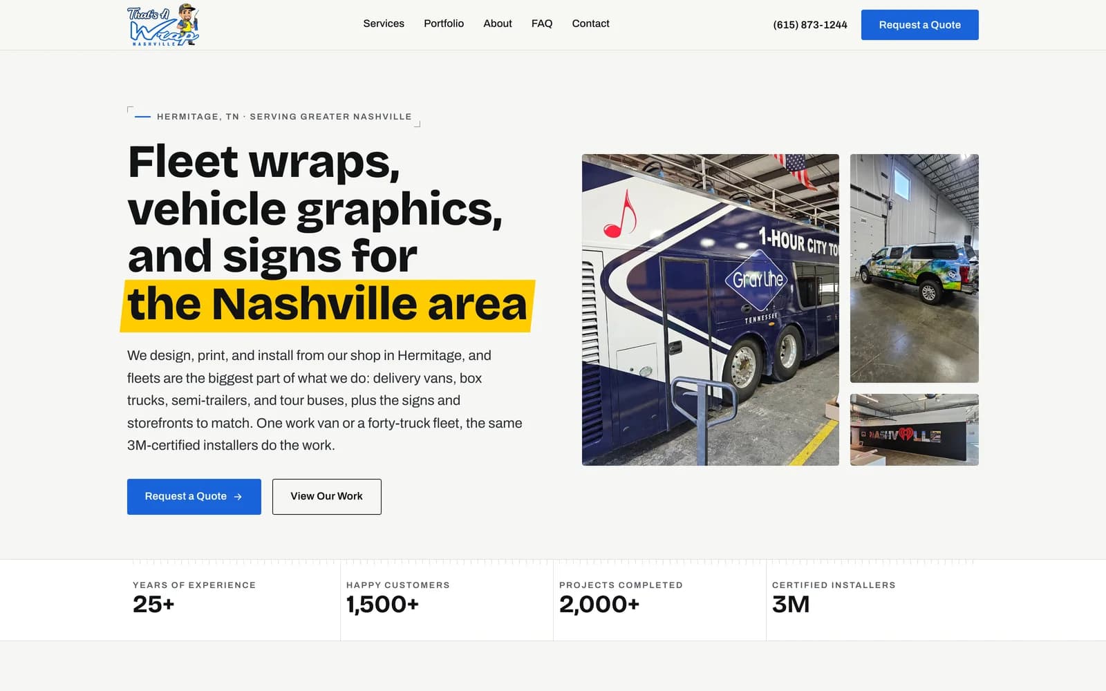
That’s A Wrap Nashville
Website · SEO / AIO/Nashville, TN
A 3M-certified wrap shop with 25 years of work and no digital presence to show for it. We built the site and ran the search program; since launch the site converts 12.5% of visitors into quote requests (GA4), and the shop fields more fleet inquiries than it did before the rebuild.
“Fleet wraps, vehicle graphics, and signs for the Nashville area”
12.5%of site visitors become quote requestsGA4, since launch
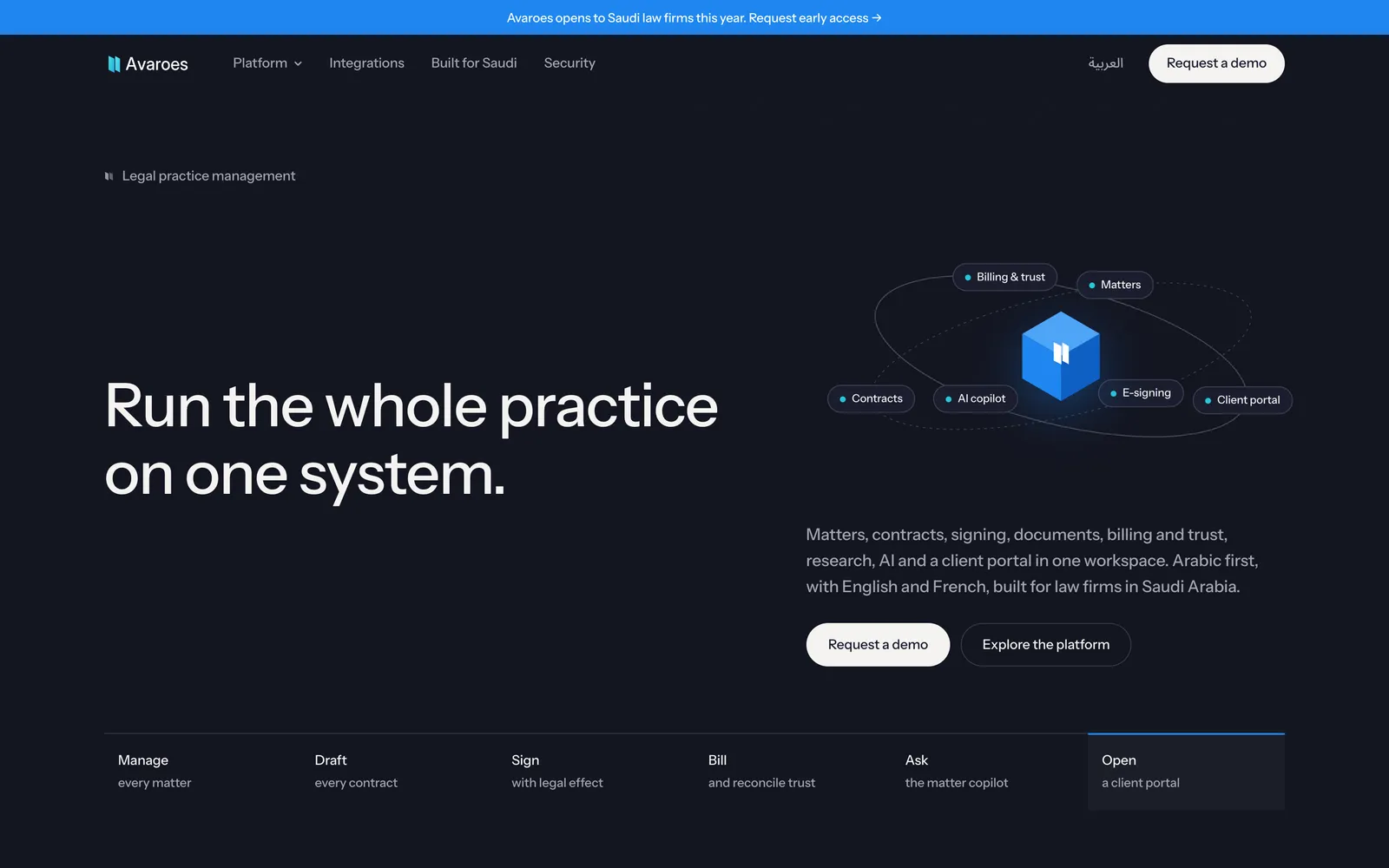
A legal platform named for Ibn Rushd, the jurist of Cordoba, which meant the identity had to hold up in a Riyadh boardroom and inside a bilingual product. We built the full system: mark, construction geometry, Arabic companion typography, motion standards, and the trilingual marketing site, documented in guidelines published in English and Arabic.
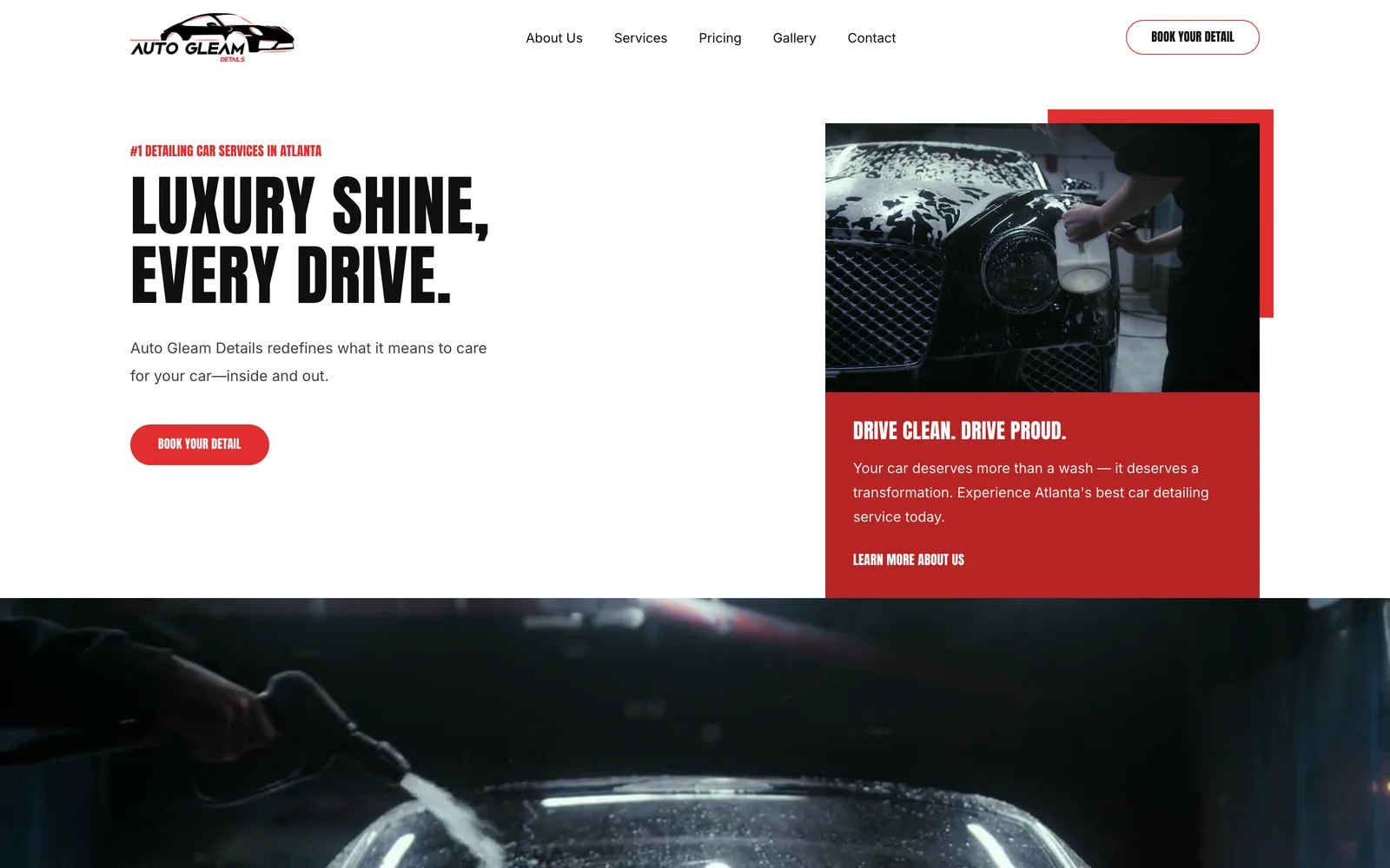
A mobile detailing operation rebuilt from the logo up: sharp red-and-black identity, a booking-first site, and photography that sells the finish rather than the buzzwords. The same rebuild is documented in the Auto Gleam case study.
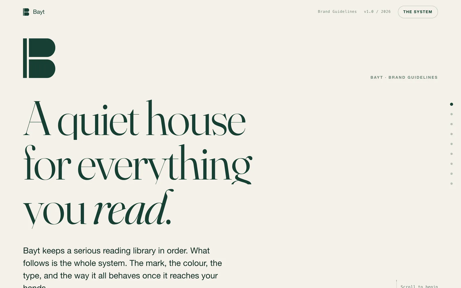
Bayt keeps a serious personal library in order (eBooks, audiobooks, comics, magazines) in files you own, on your own machine. The identity takes the product at its word, a quiet house: a bookplate mark, deep forest and vellum, serif headlines that read like a spine label. We designed the brand system and the marketing site; the product is in early access behind a gate.
A holding company that builds, acquires, and holds across software and financial services. The identity had to read as patient capital, so it uses very little: near-black, one serif, and a wordmark that does most of the talking. We designed the brand and built the site.
A pet parent app and a vet practice platform that share one health record, launched as a waitlist site ahead of the iOS app. The identity stays high-contrast red on near-black. The site runs a rotating hero over an animated field of tiles, live previews of the vet schedule and the owner’s PetPass, an AI symptom check, and a beta lottery that turns the launch countdown into sign-ups.
A software directory with an editorial spine: 120+ tools reviewed by hand, no sponsored rankings, tradeoffs stated plainly. The identity leans dark, with a violet-to-cyan signal gradient and a lime accent that does the pointing. We designed the brand and built the site.
Brand identity · Website/Middle East · EN/AR/Domain in transition
An ERP implementation firm serving manufacturing, retail, and professional services across the region. Blueprint-black with amber signal color, mono detailing that reads like a systems diagram, and a bilingual English–Arabic build. Production domain is in transition; the build is live at its staging address.
An Atlanta training outfit with real results and a 5.0 rating that deserved a site to match. Warm editorial serif, golden-hour photography, and a booking path that takes an owner from first visit to a booked evaluation in a few clicks.
A streetwear label built on scarcity (limited drops, no restocks) selling into forty-plus countries. We run the marketing behind the drops. Scarcity was the brand's idea from the start; our job is getting each drop in front of enough of the right people before it sells through.